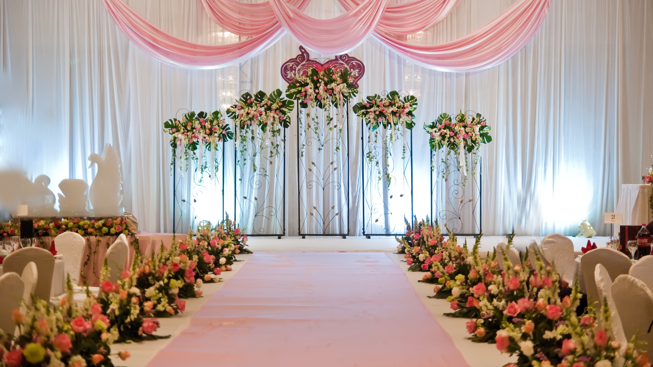
Color is one of the most influential elements in wedding design, yet it is often underestimated or treated as a purely aesthetic decision. In reality, a color palette defines the emotional tone of the celebration, guides every design choice, and ensures visual coherence from ceremony to reception.
A well-planned palette does more than look beautiful. It creates balance, reinforces the couple’s style, and transforms a collection of decorative elements into a unified experience.
Why Color Matters More Than You Think
Color shapes perception. It influences mood, atmosphere, and how guests experience a space the moment they arrive.
In a wedding setting, colors help communicate:
- The formality or intimacy of the event
- The couple’s personality and aesthetic preferences
- The overall emotional direction of the celebration
Without a clear palette, even high-quality décor can feel disconnected. With one, the entire event feels intentional.
Color as the Foundation of Design Decisions
A defined color palette acts as a design framework. It informs choices related to:
- Floral arrangements
- Linens and tablescapes
- Backdrops and installations
- Lighting temperature and intensity
- Stationery and signage
When color decisions are made early, the design process becomes more efficient and cohesive. Instead of selecting elements in isolation, every choice supports the same visual language.
Understanding Emotional Impact Through Color
Colors evoke emotional responses, whether consciously or subconsciously. This makes them a powerful storytelling tool in wedding design.
- Soft neutrals and pastels create a calm, romantic atmosphere
- Deep, rich tones convey elegance and formality
- Warm hues introduce intimacy and warmth
- Cool tones feel refined and serene
The goal is not to follow color psychology rules rigidly, but to understand how combinations influence the overall mood of the event.
Balancing Trend and Timelessness
Wedding color trends change constantly, but photographs and memories last forever. A thoughtful palette balances contemporary inspiration with timeless appeal.
Rather than choosing colors solely because they are popular, successful designs use trends as accents. This approach allows the wedding to feel current without risking a dated look in the years to come.
Timeless palettes tend to rely on:
- Neutrals as a base
- One or two focal colors
- Subtle metallic or textural accents
The Relationship Between Color and Venue
Every venue has its own visual characteristics — flooring, walls, architectural details, and natural light. A color palette must work with these elements, not compete against them.
For example:
- Bright spaces benefit from softer tones
- Dark venues often require lighter or reflective accents
- Outdoor settings allow for more organic, nature-inspired palettes
Considering the venue early ensures the palette enhances the space rather than feeling imposed.
Using Accent Colors With Intention
Accent colors add depth and personality, but they require restraint. When overused, they can overpower the design.
Strategic use of accents allows designers to highlight key areas:
- Ceremony backdrops
- Statement installations
- Tablescape details
- Custom signage
These moments of contrast draw attention without disrupting harmony.
Color Consistency From Ceremony to Reception
One of the hallmarks of professional wedding design is visual continuity. While the ceremony and reception may have different atmospheres, they should feel connected.
This does not require identical décor. Instead, consistent colors — interpreted through different materials and lighting — create a seamless transition throughout the event.
Personal Style Over Convention
There are no mandatory wedding colors. The most successful palettes are those that reflect the couple’s identity rather than expectations.
Some couples gravitate toward classic combinations, while others prefer unexpected contrasts. Both approaches are valid when executed with intention and balance.
Color should feel personal, not prescribed.
Why Professional Guidance Makes a Difference
Choosing a color palette seems simple until every decision depends on it. Professional designers understand how colors behave in real spaces, under different lighting conditions, and across multiple materials.
Their role is not to impose a palette, but to refine it — ensuring consistency, harmony, and execution at the highest level.
Color Is the Silent Language of Design
Color speaks without words. It sets the tone, shapes the experience, and frames every memory created during a wedding day.
When chosen with care and applied with intention, a color palette becomes more than decoration. It becomes the visual signature of a celebration that feels cohesive, personal, and enduring.